
Illustrator
CONTROLLING GRADIENTS WITH THE BLEND TOOL IN ILLUSTRATOR
Illustrator’s Gradient Tool is perhaps the best available in the current Adobe line-up when compared with InDesign and Photoshop’s gradient functions and gives us a lot of control over how the gradient is positioned and scaled within an object. That said, it can still sometimes be challenging to get colours to sit exactly where you want them. This is where the Blend Tool can step in as your go-to alternate gradient device.
As the name suggests The Blend Tool is used to blend objects together. I’m going to assume you are familiar with the Blend Tool so will not be going through all the various options and uses here but as a quick introduction… Select 2 or more items and go to Object>Blend>Make and you’ll see the shapes merge into each other. Blend Options gives you control over how the blending takes place. In the example below the orange square blends into a blue circle – the Spacing is set to 3 Specified Steps so we see 3 transitional shapes in between our original objects.

Notice that both shape and colour attributes are blended. If we change the Spacing to Smooth Colour (as below) we get a gradient-style colour transition. We can utilise this function to give us precision control over gradients and how gradient colours fall within our objects.


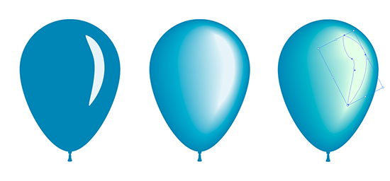
In the example below I’ve drawn a simple outline of a balloon with a pale slither that will become our highlight. Select the main round of the balloon and the highlight and Blend! Because these are still individual shapes and not a standard gradient we can go in and edit the shape, colour and position of each part in our blend.
Opacity is also blended between objects. In the example below we have 3 orange shapes set up to emulate a flame. By setting the opacity of the outer shape to 0% our blend will fade out to full transparency. Flaming vectors!

With the combination of traditional gradients and blends you can achieve very precise colour and shading effects. Opacity can be used for highlight and shadow blends so they fade seamlessly into background colours. Using 0% opacity for the outer part of a blend, as in the flame example above, allows you to position the blend anywhere on the page – this is great for adding highlights.
Consider using several blends to achieve the desired outcome. With careful choice of colours, shapes, opacity and position of your blends it’s possible to get quite convincing effects.
In the example below there are 4 blends that make up the ball with a 5th added in for the shadow beneath it. Each blend uses opacity as well as colour to achieve the right shading along with object blending modes like Multiply and Screen. On the left is the finished version. To the right I’ve separated the standard gradients that make-up the the base colours and the blends that sit over this to make up the highlights and shadows to give an idea of how this effect is brought together.

Because Blends can be shaped and positioned anywhere you choose, and then edited further still, it’s possible to go above and beyond the results available with traditional gradients… so, get blending!!